
I'm John, I harmonize business storytelling and data analytics.
I bring a unique blend of strategy and data to early-stage businesses, with a BS in Statistics from BYU and a variety of work experiences.Languages: SQL | Python | R
Excel (Formulas & VBA)
Visualization: Tableau | Looker | Figma | Keynote
Portfolio
(Click the images to explore)
Full revamp of Airbnb's pitch deck & story:

Public-facing blog articles from a BigQuery deep-dive:
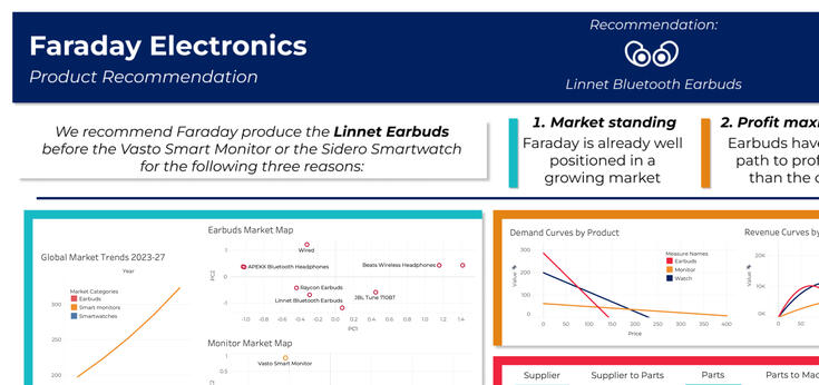
Product rec. for a tech firm in Python, SQL, & Tableau:
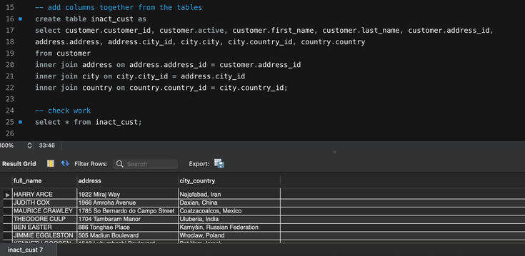
Analyzing inactive customers for a mailing list in SQL:
Capturing fees for an airport automatically in Python:
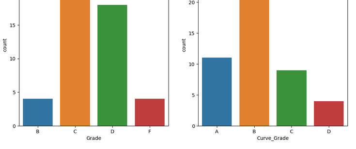
Practicing SQL integration in R/Python for class grades:
Arrest data for a county sheriff's department in Python:
KFC review quantity and quality in R Markdown:

New product idea + analysis for Spotify in Canva:

Rebranding a company story for clarity in Squarespace:

An in-process framing of a founder's story in Keynote:
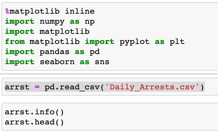
Determining arrests insights for the Montgomery Co. police department in Python
The task was to provide an exploratory summary of the data provided from Montgomery County, including visualizations.First, import all the libraries:
>>> %matplotlib inline
>>> import numpy as np
>>> import matplotlib
>>> from matplotlib import pyplot as plt
>>> import pandas as pd
>>> import seaborn as snsNext, read in the csv with the data
>>> arrst = pd.readcsv('DailyArrests.csv')Let's see what we're looking at:
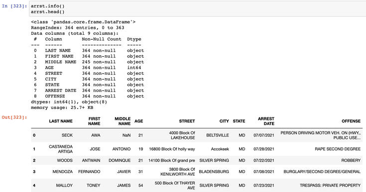
This is a table with 9 columns of ID information, and arrest information with the dates and locations. There are 364 rows.
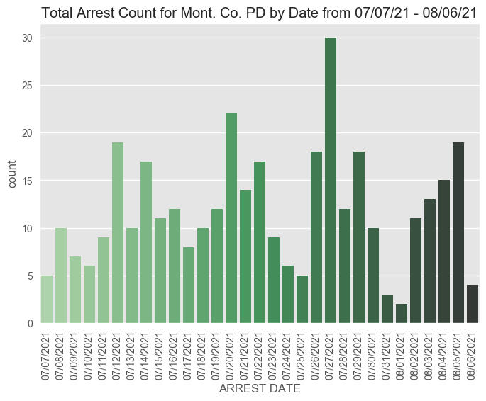
The next thought was to see if there is a pattern to the timing of arrests:
>>> #organize by date of arrest
>>> arrstdatesort = arrst.sortvalues(by='ARREST DATE')>>> #create the graph and make it pretty with labels and colors
>>> sns.countplot(x = "ARREST DATE", data = arrstdatesort, palette="Greensd")
>>> plt.xticks(rotation=90)
>>> plt.xlabel("ARREST DATE")
>>> plt.title("Total Arrest Count for Mont. Co. PD by Date from 07/07/21 - 08/06/21")
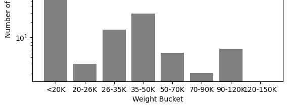
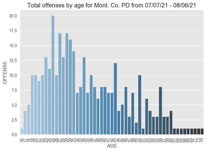
Next, creating a visualization that shows the distribution of age against crime:
>>> #organize the values by age
>>> arrstagesort = arrst.sortvalues(by='AGE')
>>> arrstagesort = arrstagesort.groupby(['AGE']).count()
>>> arrstagesort = arrstagesort.reset_index()>>> #create variables for the bar graph
>>> x1 = arrst-agesort['AGE']
>>> y1 = arrst-agesort['OFFENSE']>>> #create graph and fix labels, title, etc
>>> sns.barplot(x = x1, y = y1, data = arrst-agesort, palette= "Blues-d", errwidth = .010)
>>> plt.xticks(rotation=90)
>>> spacing = 1.200
>>> plt.title('Total offenses by age for Mont. Co. PD from 07/07/21 - 08/06/21')
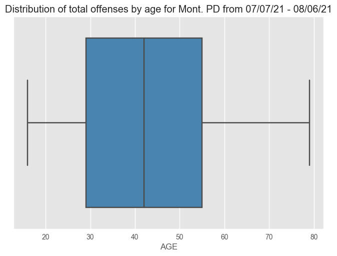
Here's a boxplot showing the same distribution:
>>> print(np.mean(arrst['AGE']), np.min(arrst['AGE']), np.max(arrst['AGE']))
>>> sns.boxplot(x = x1, data = arrstagesort, palette="Bluesd")
>>> plt.title('Distribution of total offenses by age for Mont. PD from 07/07/21 - 08/06/21')
>>> # average age of offenses is 34.9, min 16, max 79
Finally, we want to visually see which cities are the biggest offenders with a column chart:
>>> #organize the values by the city
>>> arrstcitysort = arrst.copy()
>>> arrstcitysort['CITY'] = arrstcitysort['CITY'].str.title()
>>> arrstcitysort = arrstcitysort.groupby(['CITY']).count()
>>> arrstcitysort = arrstcitysort.resetindex()>>> #create variables for the bar graph
>>> x2 = arrstcitysort['CITY']
>>> y2 = arrstcitysort['OFFENSE']>>> #create graph and fix labels, title, etc
>>> sns.set(rc={"figure.figsize":(30, 4)})
>>> sns.barplot(x = x2, y = y2, data = arrst_citysort, palette="cool")
>>> plt.xticks(rotation=90)
>>> plt.title('Total offenses by city for Mont. Co. PD from 07/07/21 - 08/06/21')
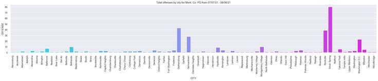
Through this analysis, it appears the police department should focus on offenders ranging in ages from 20-35, in Silver Spring, Rocksville, and Gaithersburg, and throughout the weekdays instead of the weekends.See the full code here.